The Behavior Analytics Reports dashboard presents a list of the reports generated along with a summary of the number and priority of alerts generated for each report. Reports can include activity for multiple users in a single report, allowing consolidated analysis across user groups.
NOTE: Reports (and associated report IDs) are generated for rules of type Run Once only.
Rules of type Continuous and Scheduled don’t generate reports (or associated report IDs), but addressable alerts—that is, they generate output to the Behavior Analytics Alert List.
You can access the Behavior Analytics Reports dashboard by navigating to Behavior Analytics > Reports from the Home Screen or the navigation bar.
NOTE: The Threat Manager application is highly responsive, so the arrangement of some items may differ from how they're described in this document if you are using a screen of narrow width, for example on a mobile device. All administrative functionality is, however, retained on such devices.
By default, the Behavior Analytics Reports generated for Today are displayed in the dashboard. However, you can filter the reports using the options Today, Last Week, Last Month, Last 3 Months, Last 6 Months, Last Year, or you can specify Custom dates.
In this section:
- Reports overview page
- Visualization - Report details page
Reports overview page
The Behavior Analytics Reports dashboard displays a list of reports along with the following information for each report:
Report ID: A system-generated ID which is sequentially assigned to each report.
Rule Name: The Behavior Analytics Rule name.
Date & Time: The date and time at which the alert was generated.
Urgent, High, Elevated: Number of alerts at each of these levels of priority.
Reviewed By: The user by whom the report was reviewed.
Review Status: The review status of the report, in the form of an icon. These are:
Icon | Review Status |
|---|---|
 | To Be Reviewed |
 | Flagged |
 | Reviewed |
You can sort the lists by clicking on the relevant metric. (Select once to sort in one direction, and again to sort in the opposite direction.)
Each report in the list includes additional details on the Report details page. Select anywhere in the row of the required report to access the Report details page.
NOTE: Reports (and associated report IDs) are generated for rules of type Run Once only. Rules of type Continuous and Scheduled don’t generate reports (or associated report IDs), but addressable alerts—that is, they generate output to the Behavior Analytics Alert List.
Visualization - Report details page
When you select a report entry in the Behavior Analytics Reports dashboard, the Report details page opens. On this page you can see details about the report and alerts generated, and you can also comment on and/or set the status for a report. Each report also provides granular details through various formats. These items are detailed in the subsections below.
Add a report-level comment
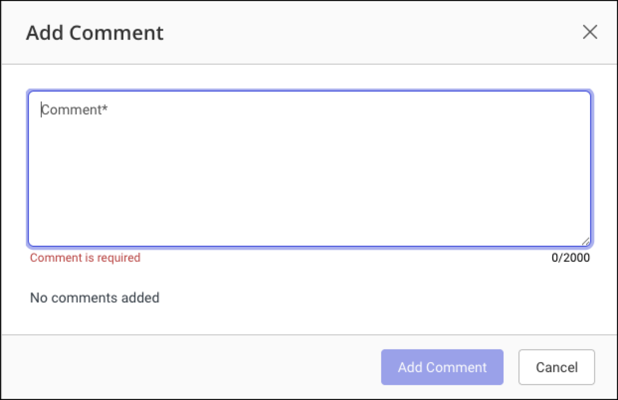
At the top of the Report details page, select the  Comments icon next to the report ID (upper left corner). The Add Comment dialog appears.
Enter your comment and select Add Comment. When a comment is added, the icon turns blue.
Alerts Summary
In the upper right of the Report details page, a high-level alerts summary is presented, showing the total number of alerts per priority level.

Setting the status of a report (including flagging a report)
At the top right of the Report details page, you can  flag the report for review.
Detail View (tab)
The Detail View shows, on a per-user basis, the alerts that a user generated on a given day. Each row shows the risk score as well as the activity counts that are attributed to the user.
NOTE: Risk scores of up to 999 display numerically. Larger values use K, M, and B terminology and are rounded to the nearest decimal, for example a risk score of 1051 will display as 1.1k.
When an activity count (number) is displayed with a gray background, this indicates that the user has exhibited a behavior different from the peer group.
When an activity count (number) is displayed with a colored background, this indicates that the user has behaved differently from the peer group and also from how that user typically behaved in the past. The color of the background is defined by the threat level associated with that risk score, from lowest (yellow) to highest (red).
TIP: You can access additional information on activity count display in Detail View by selecting Help me understand this page, at the foot of the list.
Using the tooltips provided for at-a-glance information
When you place the cursor over any activity count number, details of the risk score as well as the individual and peer-group behavior are displayed in a tooltip. These give an investigator easy visibility into the extent to which an individual has behaved differently from personal and peer-group norms:
On a peer group basis, the mean activity of the peer group daily is displayed, as well as the group threshold. The group threshold is the point at which any user in the group is exhibiting a behavior different from the behavior typically exhibited by the group.
On an individual basis, an individual mean, which is the activity that the user typically performs daily, is displayed, along with the individual standard deviation and the individual threshold. The individual threshold is the inflection point where the user is exhibiting a behavior statistically different from the user's norm.
TIP: The additional details provided for the Export activity are useful because they can help determine whether a high activity count is the result of (or skewed by) data sync from Drive or a mobile device.
Additionally, colored activity count rectangles show a fill, upon mouse-over of the rectangle or of its containing row, to indicate the extent to which that activity has contributed to the overall risk score. The greater the percentage of the rectangle filled, the greater the contribution of that activity towards the risk score. If any activity contributes one-hundred per cent to the overall risk score, its rectangle will display as a solid color upon mouse-over.
Adding a comment
Select the Comment icon in the row of a user. The Add Comment dialog appears. You can enter user-specific details of, for example: the investigation carried out, findings, inferences, and more, which might be useful for further investigation. This can also help avoid duplication of investigations. Multiple comments can be added.
Flagging a user
You can flag a user by clicking the Gray Flag icon in the row of the user. The Red Flag icon indicates that this user is currently being investigated. The Check Mark icon indicates that the investigation is complete or closed.
Viewing and downloading Activity Charts
Select a row (user) in the table for more details. The activity charts for the selected user are displayed, including all Activities, Clients, Matters, and Documents Activity Charts. You can export the Clients, Matters, and Documents details into a CSV, EXCEL, or PDF file. For more information on these charts, including how to download them, refer to Activity charts.
NOTE: When a user is selected from the Detail View, the activity charts shown remain in place (under the main chart), regardless of whether Detail View, Summary Chart, or Bubble Chart is selected. Another user can, however, be selected in the Bubble Chart tab.
Summary Chart (tab)
This is a bar graph that represents the number of prioritized alerts, by date.
You have the option to view or hide results on the chart by selecting or de-selecting threat level keys on the chart legend:

Selecting a key causes it to be struck through: any results with a threat level which is struck through (for example: Low) on the legend won't be shown. Select the key again to remove the strike-through and show the associated results.
Bubble Chart (tab)
This is an interactive chart that displays information in the form of a bubble graph. The size of the bubble is proportional to the number of clients accessed and the vertical location is proportional to the number of matters accessed. The chart gives you a graphical way to visualize the intensity of the alert.

A larger bubble indicates that information was compromised across several clients, and so the alert may be of greater urgency. When you hover or place the cursor over the bubble, you can see details such as Alert Level, User Name, Date, Risk Score, Client Count, and Matter Count.
The color of the bubble reflects the threat level associated with that risk score, from lowest (yellow) to highest (red).
You have the option to view or hide results on the chart by selecting or de-selecting threat level keys on the chart legend:
Selecting a key causes it to be struck through: any results with a threat level which is struck through (for example: Low) on the legend won't be shown. Select the key again to remove the strike-through and show the associated results.
Select one of the bubbles in the bubble chart to display detailed activity charts for the associated user.
NOTE: When a user is selected from the Bubble Chart, the activity charts shown remain in place (under the main chart), regardless of whether Detail View, Summary Chart, or Bubble Chart is selected. Another user can, however, be selected in the Detail View tab.
Activity charts
Overview and types of activity chart
The selected user’s User ID and User Name are displayed in the title bar just above the Activity charts.
For example, User ID (User Name). If a User Name isn't defined, then only the User ID is displayed.
The following charts and histograms are available:
Activities: This chart represents the counts of different activities that a user was performing within the time period being analyzed. You can select the activities you wish to display in the chart by clicking relevant activity on the activities bar located on the right-hand side of the activity chart.
Clients: This is a bar graph that represents the number of clients accessed by a user on different days within the time period being analyzed. You can drill-down on the Clients histogram to get the Client Name and Activity Count for the clients that a user accessed on a given day. To go back one level after drill-down, select Back.
Matters: This is a bar graph that represents the number of matters accessed by a user on different days within the time period being analyzed. You can drill-down on the Matters histogram to get the Matter Name, Client Name, and Activity Count for matters that a user accessed on a given day. To go back one level after drill-down, select Back.
Documents: This is a bar graph that represents the number of unique documents accessed by a user on a given day within the time period being analyzed. You can drill down on the Documents histogram to get the Document Name, Client Name, Matter Name, and the Count, showing how many documents were accessed by that user on a given day. To go back one level after drill-down, select Back.
TIP: The Activities chart displays a Day of alert label, for ease of reference. The Clients, Matters, and Documents histograms also display a Day of alert label, but only when drill-down has been performed to the day level (and the day of alert is within the range of the drilled-down chart).
NOTE: When a user is selected from the Detail View tab or Bubble Chart tab, the activity charts shown remain in place (under the main chart), regardless of whether Detail View, Summary Chart, or Bubble Chart is selected. Another user can, however, be selected in the Detail View or Bubble Chart tab.
Expand or contract the date range displayed in activity charts
You have the option to expand (or contract) the date range displayed on the activity charts, to provide a wider (or narrower) chronological context for the alert.
At the top right of the activity charts, enter a number into, or use the arrows to adjust the Days before alert field.
Each of the activity charts is immediately updated with the adjusted date range.
You can extend the date range to a maximum of 90 days before the alert.At the top right of the activity charts, enter a number into, or use the arrows to adjust the Days after alert field.
Each of the activity charts is immediately updated with the adjusted date range.
You can extend the date range to a maximum of 90 days after the alert.
Export activity charts
You can export Clients, Matters, or Documents activity information for the selected user into a CSV, Microsoft Excel, or PDF file and save it on your local file system.
NOTE: The Behavior Analytics Microsoft Excel exports are single-sheet spreadsheets and don’t include the multi-sheet summary workbook format available in Detect and Protect and Compliance > Activity Report.
Browse to Behavior Analytics > Reports and select a report to open its details page at the Detail View tab.
Select a row to open that user’s activity charts at the bottom of the page.
Beneath the Clients, Matters, or Documents chart, select the Download button.
Select Download as CSV, Download as EXCEL, or Download as PDF.
The selected file is saved to your local file system in the selected file format. The file includes activities for the specified day and time, including:The documents, matters, and clients accessed by the user.
The user’s activities on those documents, matters, and clients.
The type of documents, Client ID, Matter ID.
The Clients, Matters, or Documents accessed by a user on a given day within the specified time range, the user’s activities on those clients, matters, or documents, the type of documents, Client ID, Matter ID, and other details are available in the exported file.
Rule Details (tab)
The details about the Behavior Analytics Rule that generated the report are outlined here.
Return to Behavior Analytics Reports overview page
To return to the Behavior Analytics Reports overview page, select the All Behavior Analytics Reports button at the top left of the window. Alternatively, select Behavior Analytics > Reports from the navigation bar.