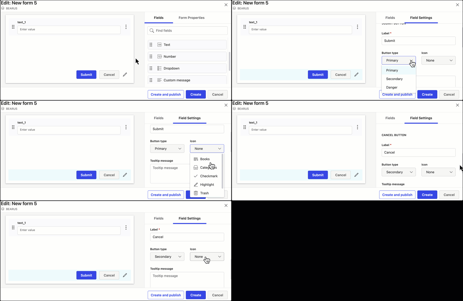
When creating a new form using Form Builder, after adding the preferred fields, you can also customize the Submit and Cancel buttons in the footer by selecting the Edit [:Pencil_3: ] icon in the lower right corner.
By default, users of the form will see the Submit and Cancel buttons when the form is rendered. The labels and styles can be customized.
Label: Set the label of the button as preferred.
Button type:
Primary: Sets the iManage defined style for primary buttons.
Secondary: Sets the iManage defined style for secondary buttons.
Danger: Sets the iManage defined style for buttons that have destructive action.
Icon: Set one of the following icons to be displayed within the button:
None
Books
Categories
Checkmark
Highlight
Trash
Tooltip message: Set the message to be displayed when the mouse’s pointer is hovered over the button.
