Introduction to Records Manager Dashboard
Overview and benefits
Records Manager Dashboard is configurable on a per-user basis and provides a range of charts for delivery requests, label queues, checked out records and boxes. Dashboard charts can provide—for example, at-a-glance overviews of essential Records Manager daily activities and instant access to work lists without the need to generate reports, and can be generated directly from pre-existing filtered lists. In addition, metrics about new file part volumes in a given period of time (using Reports charts) can be used to provide an understanding of trends, such as which practice areas or individuals are top of the list, while information about delivery requests completed in a given period of time (using Delivery Requests (Completed) charts) can help you to ascertain which practice areas or individuals are causing the highest delivery request workload. Additionally, with disposition eligibility charts, you can—for example, monitor the volume of records approaching disposition, to plan resources accordingly; the approval status of such items, and the number of pending items per responsible attorney. Stacked and clustered chart types can be used to understand trends across multiple data groups—for example, to provide insights into practice area activity by location.
Availability
All users can access the Dashboards page and create charts. However, the data displayed in the charts reflects that which is available to the user in accordance with the user's privileges and any security policy in place.
Section overview
Overviews of key dashboard features
Charts
Charts are displayed on the dashboard, and can be customized and spatially arranged to best suit your requirements.
Multiple charts can be displayed on the dashboard, and each chart presents information with custom grouping and filtering, from one of the following content types:
Boxes
Checked Out Records
Delivery Requests (Pending)
Delivery Requests (Completed)
Disposition Eligibility
Records
Label Queue
Chart data can be drilled into (where applicable) for further detail and processing. Tooltips display additional information when hovering over certain chart elements.
Chart Types
The following types of charts are available to represent the selected data:
Each chart can be given a unique name, for ease of reference. Customization and configuration options are available depending on the chart type.
Stacked and clustered charts types can be used to understand trends across multiple data groups—for example, to provide insights into practice area activity by location.
Summary Chart
Displays the total number of items of a particular content type within the scope of the filters applied.
Donut Chart
Displays the selected content type (with filters applied) as multi-colored grouped data forming the circumference of a circle. The total number of items is displayed in the center of the circle.
Vertical Bar Chart
Displays the selected content type (with filters applied) as vertical bar chart data. The total number of items encompassed by the chart is displayed at the top of the chart.
Vertical Bar Chart (Stacked)
Displays the selected content type (with filters applied) as vertical bar chart data. A bar is displayed for each main grouping, with secondary groupings stacked and proportionately represented on each bar. The total number of items encompassed by the chart is displayed at the top of the chart.
Vertical Bar Chart (Clustered)
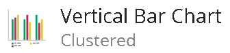
Displays the selected content type (with filters applied) as vertical bar chart data. A columnar section is displayed for each main grouping, comprising secondary groupings represented by individual bars. The total number of items encompassed by the chart is displayed at the top of the chart. The item count for each chart element is displayed in place.
Horizontal Bar Chart

Displays the selected content type (with filters applied) as horizontal bar chart data. The total number of items encompassed by the chart is displayed at the top of the chart. The item count for each chart element is displayed in place.
Horizontal Bar Chart (Stacked)
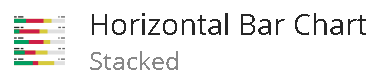
Displays the selected content type (with filters applied) as horizontal bar chart data. A bar is displayed for each main grouping, with secondary groupings stacked and proportionately represented on each bar. The total number of items encompassed by the chart is displayed at the top of the chart, and the item count for each chart element is displayed in place.
Horizontal Bar Chart (Clustered)
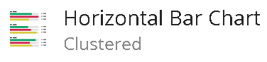
Displays the selected content type (with filters applied) as horizontal bar chart data. A horizontal section is displayed for each main grouping, comprising secondary groupings represented by individual horizontal bars. The total number of items encompassed by the chart is displayed at the top of the chart, and the item count for each chart element is displayed in place.
Quick creation of charts from (existing) filtered item lists
Charts can be created and added to the dashboard quickly by selecting Save to Dashboard available on any list under: Boxes; Requests (Pending or Completed); Checked Out; Label Queue, or Disposition Eligibility. Any filtering applied to such a list is retained in the chart, but this can be adjusted if required.
For more information, refer to Saving existing lists as dashboard charts
Grouping options
You can select how content displayed in charts is grouped. Each type of chart content selected has corresponding grouping options. For example, you can group Checked Out Records by who they are Checked Out To, by Home Location, or by Record Type, and so on.
Some types of grouping also have a secondary grouping option, when a stacked or clustered chart type is selected.
For more information, refer to Adding new charts to the dashboard.
Filters
A comprehensive selection of filtering options is available for each chart content type, enabling you to refine the displayed information as required. Filters available include Item Type, Date Created, Home Location, Record Status, Print Status, and more. For more information about filters, refer to Filters.
Advanced Options
Advanced configuration of charts enables you to specify auto-refresh time, number of groupings to show, and chart display parameters such as color and layout. The advanced options available depend on the type of chart selected.
For more information, refer to Adding new charts to the dashboard.
Saving existing lists as dashboard charts
You can create charts quickly by selecting Save to Dashboard, available on any list under Boxes; Requests; Checked Out; Label Queue or Disposition Eligibility. Any filtering applied to such a list is also applied to the chart.
Charts created in this way are added automatically to the dashboard.
Example
To save a filtered list of boxes, browse to the Boxes page and apply filters as required:
Select
 .
.Select Save to Dashboard.
Add a chart Name.
Select the type of chart and edit any other parameters as required.
NOTE:
For detailed information about parameters available, refer to Adding new charts to the dashboard.
Unlike when using filters in Add Chart, the full set of filtering options is supported when editing list on a page. (Refer to Filters.)
Select OK.
A chart of selected type, reflecting the (filtered) list, is added to the dashboard.
If required, you can reposition the charts on the dashboard. Refer to Rearranging charts and modifying dashboard layout.
Adding new charts to the dashboard
Procedure
To add a new chart to the dashboard (and not by saving an existing list as a dashboard chart):
Browse to the Dashboard page.
Select Add Chart.
Add a chart Name.
Select Chart Type from:
Horizontal Bar Chart (Clustered)
For more information on each type of chart, refer to Chart Types.
Select Chart Content, and for applicable chart types, specify what content is Grouped by, and what to Separate Groupings by. The following options are available:
Boxes, which can be Grouped by:
Circulation Status
Created Date, for which there are options to Group the dates by.
Office/Department, for which the Location group can be selected.
Records Status
For stacked or clustered chart types, you can specify what the selected grouping is separated by.
Checked Out Records, which can be Grouped by:
Checked Out To
Circulation Date
Home Location, for which the Location group can be selected.
Office/Department, for which the Location group can be selected.
Record Status
Record Type
Stacked or clustered chart types, you can specify what the selected grouping is separated by.
Delivery Requests (Pending), which can be Grouped by:
Assignee
Circulation Status
Delivery Location, for which the Location group can be selected.
Handling Duration
Home Location, for which the Location group can be selected.
Priority
Request Status
Requested By
Requested For
and for stacked or clustered chart types, you can specify what the selected grouping is separated by.
Delivery Requests (Completed), which can be Grouped by:
Assignee
Completed Date
Delivery Location, for which the Location group can be selected.
Handling Duration
Home Location, for which the Location group can be selected.
Practice Area
Priority
Requested By
Requested For
For stacked or clustered chart types, you can specify what the selected grouping is separated by.
Records, which can be Grouped by:
Circulation Status
Created By
Created Date, for which there are options to group the dates by.
Home Location, for which the Location group can be selected.
Media Type
Office/Department, for which the Location group can be selected.
Practice Area
Record Status
Record Type
For stacked or clustered chart types, you can specify what the selected grouping is separated by.
Disposition Eligibility, which can be Grouped by:
Approval Status of Approved, Pending, or Denied.
Client
Eligibility Date, for which there are options to group the dates by.
Home Location, for which the Location group can be selected.
Matter
Media Type
Office/Department, for which the Location group can be selected.
Physical/Electronic
Practice Area
Responsible Attorney and for stacked or clustered chart types, you can specify what the selected grouping is separated by.
Retention Schedule
Label Queue, which can be Grouped by:
Created Date, for which there are options to group the dates by.
Home Location, for which the Location group can be selected.
Label Queued By
Office/Department , for which the Location group can be selected.
Record Status
and for stacked or clustered chart types, you can specify what the selected grouping is separated by.
When grouping by Home Location, Delivery Location, or Office/Department the default Location Groups available may include:
Building
Enterprise
Warehouse
Building
Floor
Conference Room
Offline
Offsite
File Room
Office
NOTE: iManage Work Servers may be displayed as home locations of disposition-eligible items for which the home location is otherwise unassigned.
When grouping by Created Date, Circulation Date, or Completed Date, the Group Dates by available are:
Days
Calendar Weeks
Calendar Months
Calendar Quarters
Calendar Years
Date Bands: Which gives groupings per filter selection of Today, 1–7 Days, 8–30 Days, 31–60 Days, 61–90 Days, More than 90 Days.
When a chart is grouped by date, all date value entries of the specified date type— for example, weeks, within the specified range, are displayed.
NOTE: The Group Dates by selection always defines the groups that the chart displays, regardless of the date range and value specified in chart filters for that chart.
For example, if Group Dates by is set to Days, and the Created Date filter is set to Last 3 Calendar Years, the chart will display in days. However, not all (3x365=)1,095 days will be displayed, but rather the Number of Groupings value defined in Advanced Options.
Consideration should therefore be given to aligning the Group Dates by, Filter date type and Advanced Options, in a way that ensures a desirable chart display.
When using stacked or clustered chart types, you can separate specified groupings. The grouping separations available for a chart are defined by Chart Content and what it's Grouped By. In accordance with such availability, you can Separate Groupings by:
Client
Created Date
with further group the dates by options.
Record Status
Circulation Status
Home Location
with further Location group options.
Checked Out to
Circulation Date
with further group the dates by options.
Record Type
Delivery Location
with further Location Groups options.
Handling Duration
Matter
Priority
Request Status
Requested by
Requested for
Practice Area
Physical/Electronic
Retention Schedule
Completed Date
Created by
Media Type
Label Queued by
Eligibility Date
with further group the dates by options.
Office/department
with further Location group options.
Responsible Attorney
Select View Filters to add or edit filters, or specify ranges as required.
Some filters support a search input field so a specific value can be looked up.
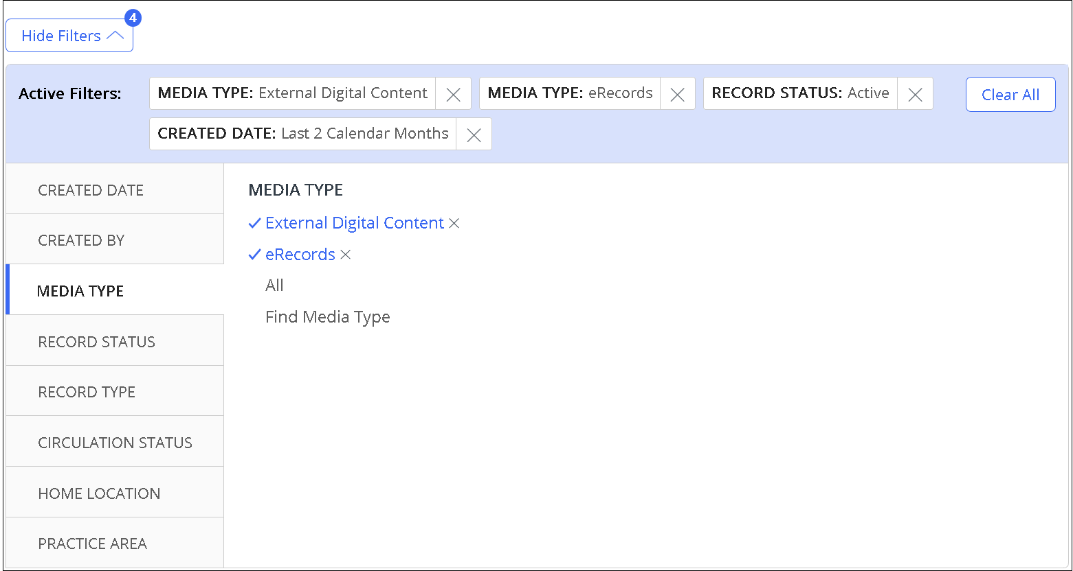
The number of filters applied is displayed as a number on View Filters, for example:
Active Filters are also displayed.
You can:Remove an active filter by selecting
 adjacent to the filter.
Clear filters of a particular type by selecting the All option for that filter.
Clear all filters by selecting Clear All.
Figure: example of active filters displays
For more information about filters, refer to Filters.
NOTE: Unlike the filters on other pages, any users selected and later deselected in chart filters are retained as pre-selected users, that is, they're available for selection again without searching. Also refer to Saving existing lists as dashboard charts.
Modify the Advanced Options as required. For details, refer to Advanced Options below.
Select OK.
The chart is added to the dashboard. The "Added to Dashboard" success message is displayed.If required, you can reposition the chart on the dashboard. Refer to Rearranging charts and modifying dashboard layout.
Advanced Options
Each chart type has a set of advanced options available. When adding a chart from Add Chart (or editing a chart):
Select Advanced Options.
All types of charts have an Auto Refresh time option. This specifies the frequency of chart data refresh. Select Auto Refresh and then select from the following options:
Every 5 Minutes
Every 15 Minutes
Every Hour
Each type of chart, except Summary Chart, has a Number of Groupings option. This defines the number of data groupings that are displayed in the chart. If the number of data groupings is higher than the number of groupings to be displayed in the chart, the highest value groupings are displayed individually up to the maximum (or custom) grouping count, and the other groupings are displayed together in a single grouping labeled Other.
NOTE: Charts grouped by date don't have an Other grouping.The settings available are:
Show maximum: Data groupings (ordered by data value) are displayed as individual groups up to the maximum number of groupings allowed. Any additional data groupings are displayed together as Other.
TIP: A tooltip displays the maximum value set for your system.Custom: Select this option to define the (number of) Groupings. The recommended maximum number that can be entered (which corresponds to the maximum value of groupings set for your system) is shown. With this setting, data groupings (ordered by data value) are displayed as individual groups up to the custom number of top groupings allowed. Any additional data groupings are displayed together as Other.
NOTE: The recommended maximum is displayed to reflect the (recommended) maximum number of groupings set by your system administrator. However, this value can be exceeded if your chart requires, in which case your selected number of groupings are displayed.When creating or editing a chart, Custom value is retained for a given secondary grouping, and regardless of any filters set. However, if what the chart is Grouped By is changed, this setting is returned to the default state of Show maximum.
For stacked and clustered chart types, the Number of Separated Groupings option helps you to define the number of data sub-groupings displayed for each chart grouping. The settings available are:
Show maximum: Sub-groupings (ordered by data value) are displayed as individual groups up to the maximum number of sub-groupings allowed. Any additional sub-groupings are displayed together as Other.
TIP: A tooltip displays the maximum value set for your system.Custom: Select this option to define the (number of) Separated Groupings. The maximum number that can be entered (which corresponds to the maximum value of sub-groupings set for your system) is shown. With this setting, data groupings (ordered by data value) are displayed as individual groups up to the custom number of sub-groupings allowed. Any additional sub-groupings are displayed together as Other.
NOTE: The recommended maximum is displayed to reflect the (recommended) maximum number of groupings set by your system administrator. However, this value can be exceeded if your chart requires, and your selected number of groupings will be displayed.When creating or editing a chart, Custom value is retained for a given secondary grouping, and regardless of any filters set. However, if what the chart is Grouped By is changed, this setting is returned to the default state of Show maximum.
Vertical Bar Chart (not stacked or clustered type) and Horizontal Bar Chart (not stacked or clustered type) each have their own set of advanced options, as follows:
Vertical Bar Chart
Layout options:
Single Color with Labels: Select this option to display the bar chart in a single color, with the corresponding data label at the foot of the bar. When this option is selected, you can select the
Chart Color, from the available palette.
Multi Color with Legend
Horizontal Bar Chart
Data Format options:
Number
Percentage
Chart Color: Select the chart color from the available palette.
If all chart settings are defined, select OK to add the chart to the dashboard.
Viewing or drilling in to chart data
Charts let you view or access additional information besides what's displayed in the main Dashboard view.
Viewing additional chart data
To view additional information in the chart data without leaving the dashboard, hover over the chart element for which you require more detail. A tooltip with information about the data comprising that chart element is displayed. For further information, refer to drilling in to the chart data.
Drilling in to chart data
Chart data can be drilled into for further detail and processing.
To drill into chart data, simply select the grouping or number of the chart that represents the data that you wish to drill into.
For most types of chart, the corresponding page—for example, Requests page, opens with a list of the items under that grouping or number, and with any filtering applied per the chart data.
For a Records type chart, a search results page displays with a list of the items under that grouping or number, and with any filtering applied per the chart data.
Chart elements that can be drilled into are:
Summary Chart
Number (total)
Donut Chart
Number (total)
Any groupings comprising the circumference of the donut
Legend
Vertical Bar Chart (all types)
Number (total)
Any groupings (bars) on the bar chart
Legend (where applicable)
Horizontal Bar Chart (all types)
Number (total)
Any groupings (bars) on the bar chart
For charts that are grouped by a value that's not mandatory, such as by Priority for delivery requests, items without that value are grouped as Unspecified and can be drilled into.
NOTE:
It isn't possible to drill into the Other grouping, because it consists (or may consist) of a collection of different data sets.
It's also not possible to drill into a Prior type grouping (for example, Prior Weeks) of Disposition Eligibility charts filtered for overdue eligibility date.
Editing (or removing) charts
Editing a chart
Existing charts can be edited if required. All chart parameters can be edited, except Chart Content.
To edit a chart:
On the Dashboard page, on the upper right corner of the chart you wish to edit, select
 .
.Select Edit.
In the Edit dialog, you can modify:
Chart Name
Grouped By
and (if applicable) Location Groups
Filters
Chart Type
Advanced Options for the chart type selected.
Select OK to apply changes to the chart.
For detailed information about these editable parameters, refer to Procedure for adding a new chart.
Removing a chart
To delete a chart:
On the Dashboard page, in the upper-right corner of the chart you wish to remove, select
. Select Remove.
On the confirmation message, select Confirm.
The chart is removed and a success message is displayed.
Manual refresh of chart data
Charts data is refreshed per the schedule defined in the Auto Refresh setting for each chart. However, you also have the option to refresh the chart data manually—per chart or for all charts simultaneously.
For more information about Auto Refresh frequency, refer to Advanced Options.
Manually refreshing one chart
On the Dashboard page, in the upper-right corner of the chart you wish to refresh, select
.Select Refresh. The chart data is refreshed.
Manually refreshing all charts
On the upper-right of the Dashboard page, select
. Select Refresh All. The chart data for all charts is refreshed.
Rearranging charts and modifying dashboard layout
Rearranging charts
To move a chart to a different position:
Hover over an empty area of the chart. A 'hand' pointer is displayed.
Drag the chart to the new position. Other charts are dynamically repositioned as you drag.
Modifying dashboard layout
Dashboard charts are arranged in a columnar view and each type of chart has the same width.
You can adjust the number of columns shown as follows:
In the upper-right of the Dashboard page, select
.Select Dashboard Settings.
Select the number of columns from the drop-down list.
Select OK.
NOTE: As with all interface elements in the web client, the layout is responsive. For mobile devices, no more than three columns are typically shown, even if this option is set to a number higher than 3.